

Dr. Copper and Mr. Oil
Dr. Copper and Mr. Oil
A skeptic's case for copper in the net zero transition.

Copper prices have increased markedly of late, marking all-time highs.
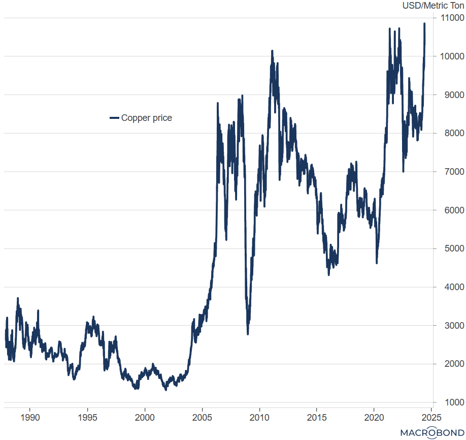
And as so often with commodities, the market narrative is: surging demand runs into sticky supply.
Copper being a “transition metal” is a key input for many goods that are important for decarbonization: EVs, wind farms, solar panels. On the other hand, it takes a long time to develop a new mine (between five and fifteen years, apparently).
Now, I’ve been hearing this story for copper since a previous peak in 2011 - it didn’t prevent the price from plummeting subsequently. And experienced investors will recognize a variant of the “new regime” narrative at play which takes hold during bubbles - “this time is different, because ..”.
So a healthy dose of skepticism is not misplaced.
But might this time really be different for Dr. Copper?
The one thing about the current narrative that I’m buying into is that, arguably, the transition to net zero emissions is in full swing. We know it’s happening because we see it - to me, it feels like every day there’s more EVs on the street.
Anecdotes aside, serious forecasters expect tight markets for copper (and other transition metals).
But I don’t want to get into too much detail - this is a macro blog, after all. Instead, I’ll use the copper story as a launch pad for a couple of really simple, big picture thoughts on commodity prices and investing in the transition.
And since we’re talking about net zero, we are transitioning away from hydrocarbons. So I’ll also look at the oil price.1
But for now, back to copper.
The first thing that strikes me (see chart below) is that, while the recent rally has copper at all time highs in dollar terms, adjusted for inflation the price of copper is still far away from its historical peak.2 The real price of copper peaked in early 2011, and we’re still a good 25% off. (No doubt copper bulls would argue this is part of their case - I sympathize.)
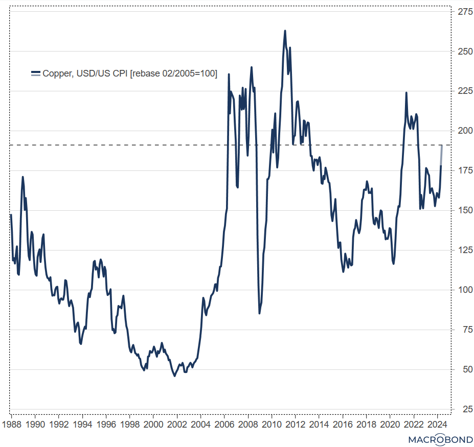
Why is the inflation-adjusted price perspective useful?
First, in an economic sense, expressing a price in relation to all other prices in the economy (the CPI) gives a much better idea of the value of the good. In a market economy, it’s relative prices that signal scarcity.
Second, because an investor can gauge whether a particular asset protects her purchasing power. It turns out that copper has failed to provide a consistent hedge against inflation. As we’ll see below, that’s also the case for oil. (In the above chart, if you follow the dashed lines from the current real copper price to the left you get the entry points at which you would now be “breaking even” in real terms.)
So here’s a first conclusion: the proposition that commodities, being “real assets”, provide a hedge against inflation is not generally true.
That’s because commodity prices are subject to massive swings.
One reason is that the demand for, and hence the price of, copper and oil are very cyclical (investment jargon: they have a very “high beta” with respect to global economic activity). Supply on the other hand tends to be more constrained in the near term (even though oil supply has become more responsive since the “shale revolution” of the early 2010s). So the price needs to move a lot for these markets to clear (abstracting from storage).
In fact, copper and oil prices move together a lot: 3
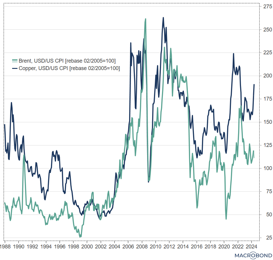
The other thing that stands out when looking at this chart is the long term price trends (again, in real terms - inflation matters a lot more in the long run).
Copper and oil prices have a big upward shift in common, in the early 2000s. From there, however, the long term developments are different.4
The long term trend for the real price of oil is actually down. Again, that’s likely to reflect the “shale revolution”: the price took a step down in the first half of the 2010s, from which it has never recovered. (That is, OPEC hasn’t been able to prevent a substantial erosion of the oil price.)
By contrast, the real price of copper has held up much better: while it’s been highly volatile, it’s average has been roughly constant for the last twenty years.
So there has been a clear outperformance of copper over this period: it’s price has had a flat trend in real terms, while the price of oil has trended down. That said, there’s a cautionary note here for the current market narrative on copper: history suggests that in the long run supply does keep pace with demand - else the real price wouldn’t have stayed constant.
So here’s another important conclusion: long term trends in commodity prices depend a lot on supply developments, and in particular - the shale story suggests - on extraction technology.
Now, I claim no expertise in mining, but it’s not obvious to me why that shouldn’t apply to copper as well (if you know more than I do, please educate me in the comments!).
Let’s recap.
The bullish “transition metal” story on copper - of too much demand chasing too little supply - broadly makes sense to me. Assuming that’s not fully in the price yet, copper looks like a buy (provided one is cognizant of the lessons from history: massive price volatility, supply likely to catch up in the long run).
What about oil?
Many argue that since the net zero transition implies waning demand for hydrocarbons, oil is a sell: global oil consumption may still be increasing, but forward-looking financial markets should start discounting the transition. That there hasn’t been a sustained increase in price despite the situation in the Middle East is taken as evidence for this story.
Maybe. But I think it isn’t quite that simple. The supply of oil may also be declining going forward due to less investment in extraction, so what happens to the oil price is not clear to me. I won’t be adding short oil to my long copper position just yet.
Contrasting copper and oil also makes sense for practical reasons: compared with some of the more niche transition metals, they are traded on large, reasonably liquid markets with a long price history.
In the chart I have deflated the copper price in dollars by US CPI and indexed it at 100 at an arbitrary date.
I’m sticking with real prices for both copper and oil in the chart, but most of the high frequency chop comes from the dollar prices.
I’m looking at prices since 1987 because that’s when the LME series for the copper price starts; there are very long time series for oil prices available, with some researchers identifying “three epochs” of oil with data starting 1861.