

There’s both good news and bad news in the current level of the profit share.

Source: Photo by nine koepfer on Unsplash
In my previous newsletter I added some pessimistic topspin to the Bank for International Settlement’s recent Annual Report by focusing on the interaction of AI-related stock market risk and macro risk (see Artificial Exuberance) – although I would still disavow any responsibility for this week’s sell-off.
(As an aside, I started my career at a major sell-side firm, where my first working day was October 22, 2007 – the day of the (then) all-time high of the S&P. Not everyone believes me when I insist that what happened afterwards wasn't my fault.)
In any case, following last week’s post I was asked whether there’s any purely macro indicator that I look at which could help with calling the peak of the stock market.
Now, in general you should never ask a macro economist to call the stock market, but I’ll try to oblige on the indicator.
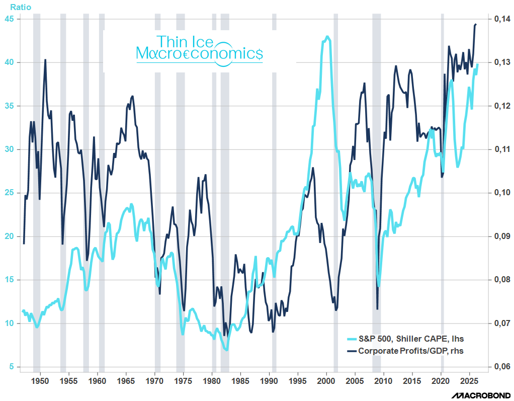
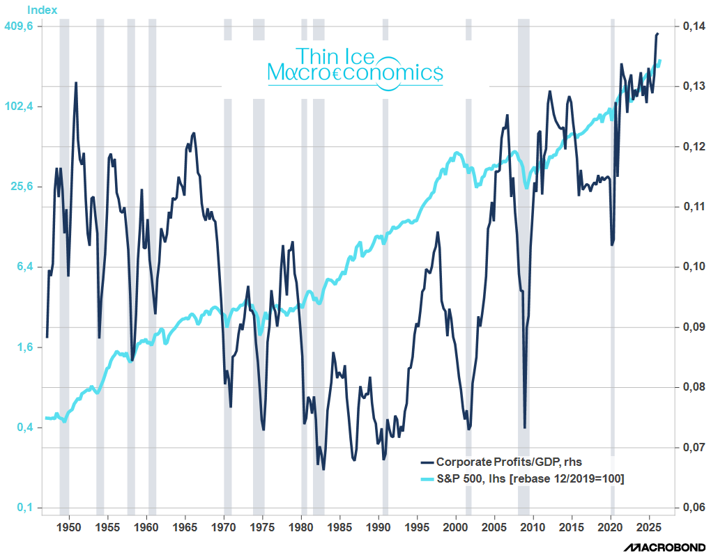
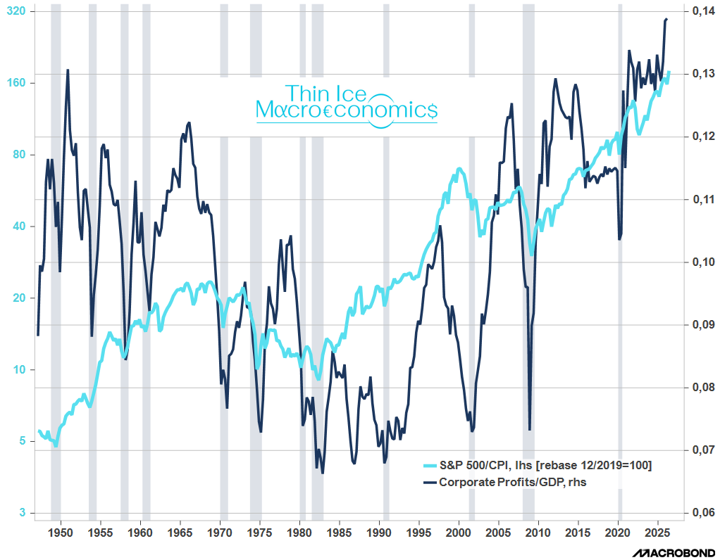
The charts below show corporate profits (with inventory valuation and capital consumption adjustments) as a share of income – henceforth: profits to GDP or the profit share. I plot this against Shiller’s CAPE as the most common measure of stock market multiple; and against the S&P and the S&P in real terms (each in logs).
Source: BEA, Macrobond
You’d think that the stock market would lead the profit share: the stock market is forward looking, so when it smells higher profits, multiples and the market rise. Turns out it’s not like that.
It’s normally profits to GDP that turns first. The stock market usually keeps going until the economy runs out of runway, i.e. until there’s a recession (grey shaded areas).
During the dotcom bubble, profits peaked in the third quarter of 1997, while CAPE didn’t turn decisively for another three years. In the 2000s during the subprime bubble (which ended in a financial crisis), the profit share peaked in 2006Q3. CAPE and the economy didn’t turn for another year.
Outside of bubbles, like the mid-eighties, the profit share peaked, and then fell, but the market kept going until the recession of the early 1990s – itself associated with the oil price spike from the first Gulf War. Only prior to the pandemic did CAPE turn before the profit share – and I guess it’s not because the stock market saw covid coming.
In the 1980s, however, the profit share was a poor indicator: it turned down, but the economy didn’t succumb, and neither did equities.
Still, if you want a single series to look at that comes off the shelf from government statisticians, it’s the profit share. Most of the time, a decline in the profit share presaged a recession and a bear market.
Now, there’s good news and bad news in this chart about our current predicament.
The good news is that the stock market has increased in tandem with profits: we may have nosebleed valuations, but profits as a share of income are rising, too. In fact, the profit share has soared by a further percentage point of GDP in the last four quarters to 26Q1 (latest available numbers).
The bad news is that the profit share is at an all-time high since 1948, when the standard quarterly US national accounts profit series starts.
Now, there’s no economic law that says the profit share can’t rise above 14% of GDP – after all, the long term trend since the mid-80s is up. But the profit share can’t keep rising forever. One reason is because it comes at the expense of the labor share. Tech profits won’t be economically sustainable – never mind politically – if they don’t also generate income for labour. The expansion will be all the more vulnerable, if it’s only based on capex.
Great Macro-Finance take! Practical and insightful! Keep them coming! Thank you!
I look at these metrics also from an equities guy angle. Playing with various complementary nuances:
- besides CAPE, checking for S&P 500 FCF Yield, Price/Sales
- besides recession periods charted, see how it looks with equities drawdowns of 20% or more
- going back with the economy and stock market only until 1985 or 1995 to capture more of the new techie economy, the 'new regime' or the 'regime change' like econs would say ;)
- adjust for the bigger stock buybacks, and the rising share of overseas revenues for the S&P 500 companies (40% nowadays, while before smaller)
Many ways to look at it, and definitely 2-4 charts can be very informative and useful in terms of telling us the easy to forget kind reminder: 'Price is what you Pay, Value is what you Get', and a gauge where we are in the business cycle.
Have a great weekend Spyros!
P.S. in my next reports I will cover these nuances and other complementary approaches and time series: the more of them align, the stronger the signal.